EXCITING UPDATE - Loft Condo Renovation Wins HGTV Editors' Choice!
Check out the Before and After images of the industrial chic downtown loft condo that earned Jennifer Stoner an HGTV 2019 Designer Of The Year Nomination!
News Flash . . . Jennifer Stoner Interiors has won the HGTV Editors’ Choice Award for the 2019 Designer Of The Year in the category of “Big City Digs” for our work on this downtown Richmond industrial loft condo.
Here’s the backstory on this fun project with some great before and after photos!
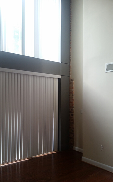
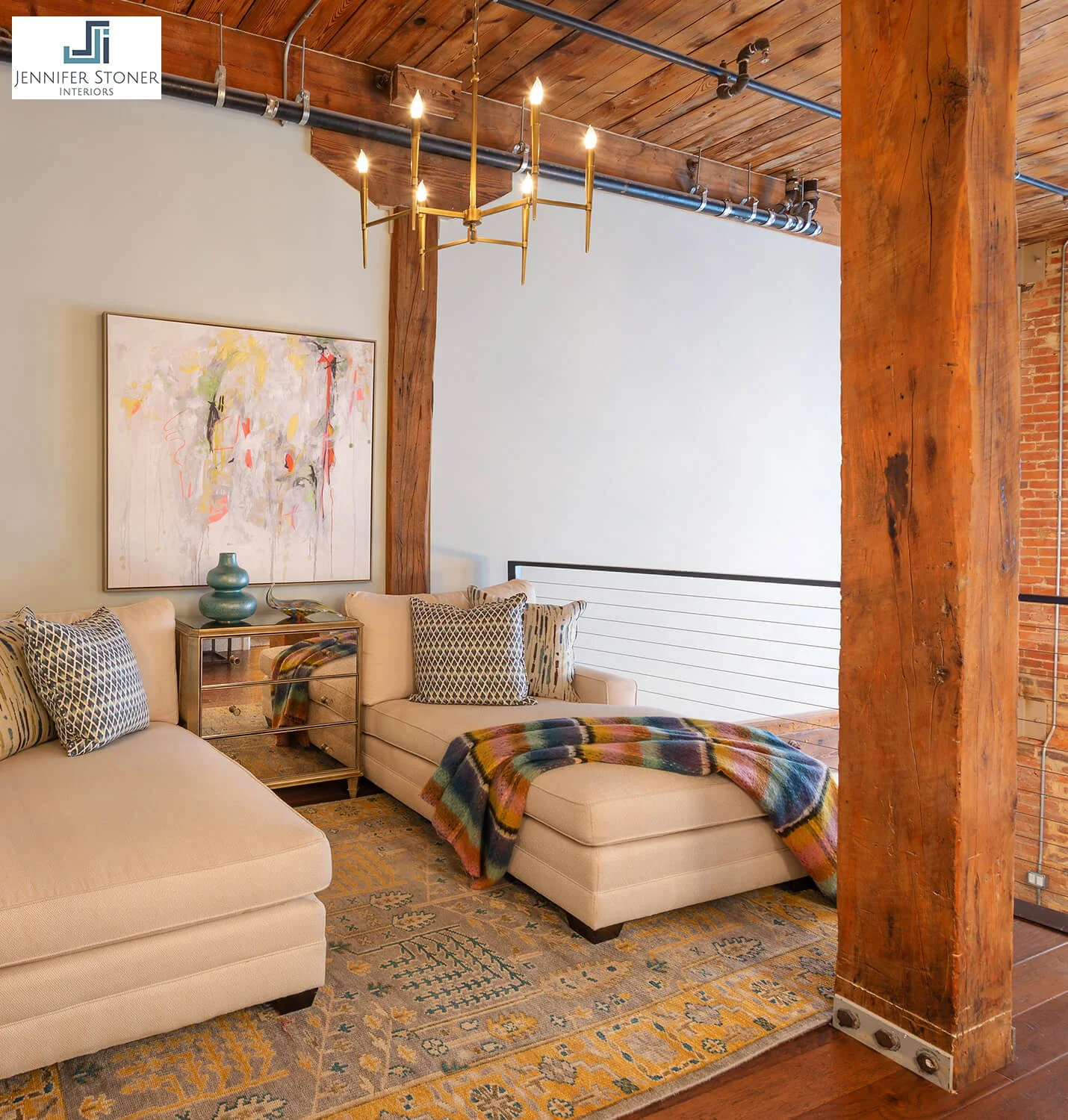
When we were approached to undertake a complete renovation of a downtown industrial loft for a young single professional, we were excited with all of the potential that the condo presented. Rockett’s Landing is a condo development in downtown Richmond, Virginia built in an old turn of the century industrial factory. The units boast exposed brick, wooden beams and plank ceilings. Unfortunately, they also included rather pedestrian wood floors, finishes, kitchens and baths. An update was sorely needed.
Rocketts Landing Cedar Works Building - Richmond, Virginia
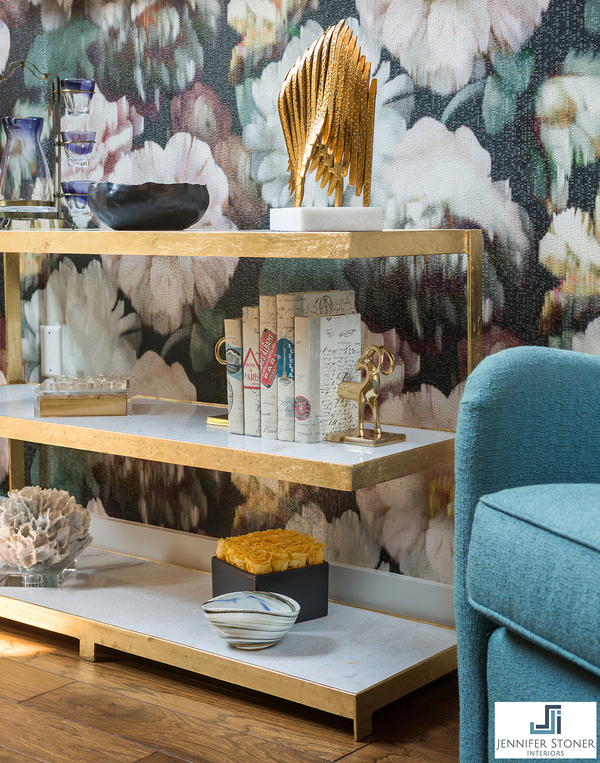
Our client’s condo is a two bedroom / two bathroom unit with a large two story great room and a loft den space. We retained Mike Terrell of River City Constructors to help us with the renovation. We started by removing all of the existing wood floors, tile floors and carpet. We replaced the prefinished wood floors and kitchen tile floor with a more rustic reclaimed-looking engineered wood floor. We also updated all of the interior lighting with some spectacular new fixtures!
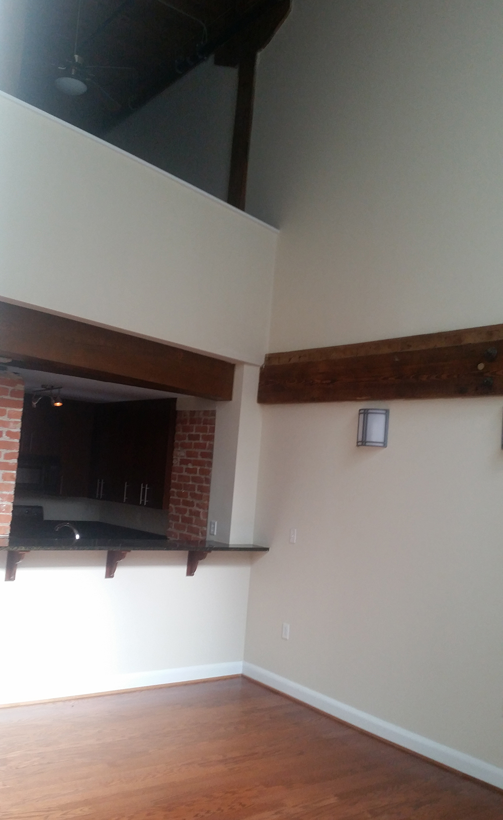
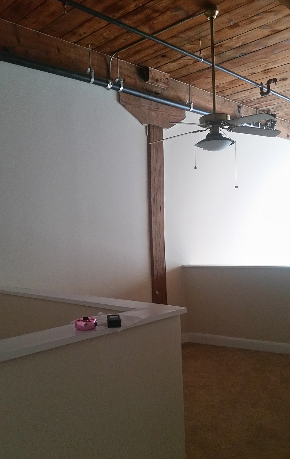
Great Room - BEFORE
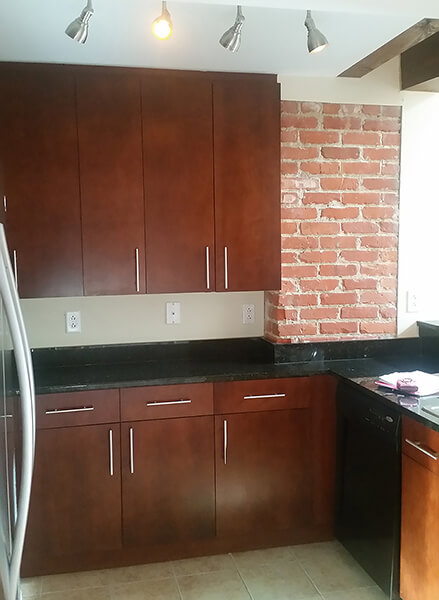
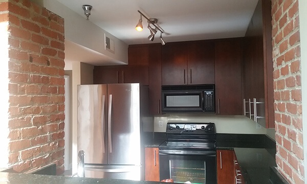
The kitchen is very small and had dark cabinets, dark countertops and poor lighting. We replaced all of her appliances, updated with new lighter custom cabinets and a unique light fixture that helped us better distribute the light within the space. We then added a touch of glam with the antique mirrored tile backsplash which was also designed to help bounce more light within the space.
The loft space that overlooks the great room was closed in by a very obtrusive sheetrock knee wall. We demolished that knee wall and replaced it with cable railing to provide a more connected and open space. We also removed the knee wall that served as the stairwell enclosure and replaced it with the same cable rail system.
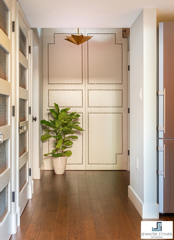
Our client wanted to close off access to a building hallway which led to the storage units, so we created a false wall at the end of her hallway with an upholstered pearl leather panel. We also replaced all of the interior doors in the condo. Some of those doors were louvered to provide ventilation for AC Equipment and Laundry Machines. So Mike, who is an excellent carpenter, created these custom doors that I designed with the perforated metal screen inserts.
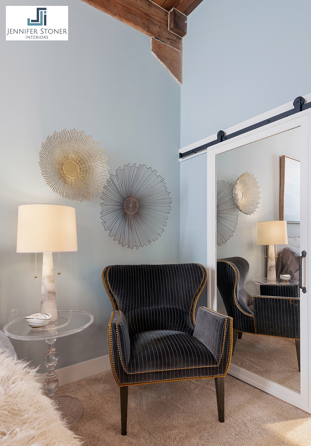
Mike also created a great mirrored barn door entry to her master closet. Our client loved this little glam touch!
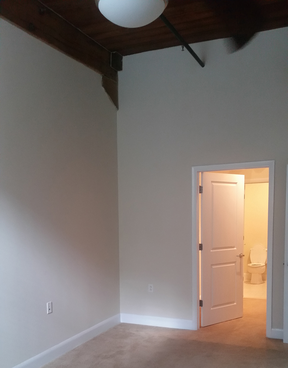
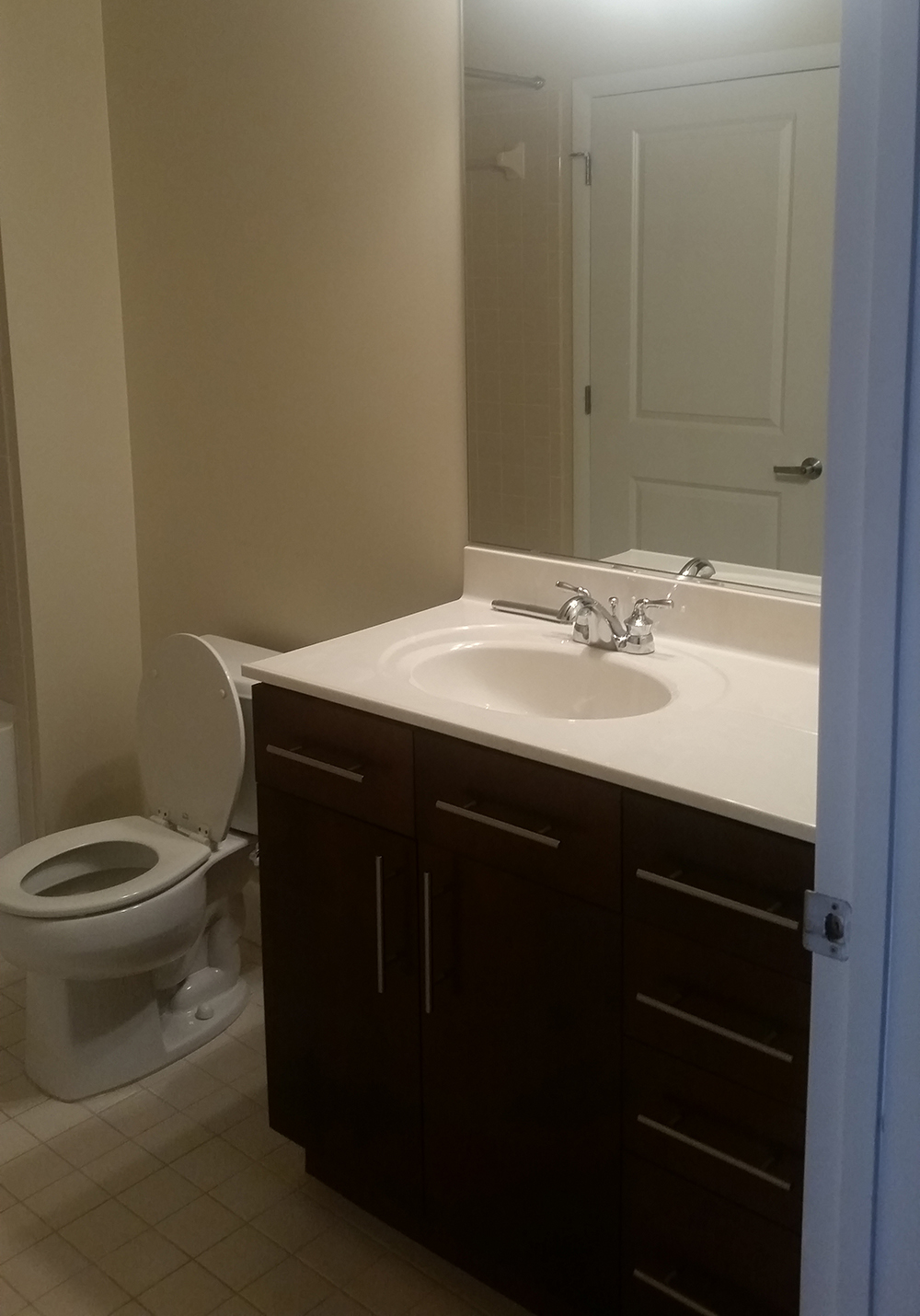
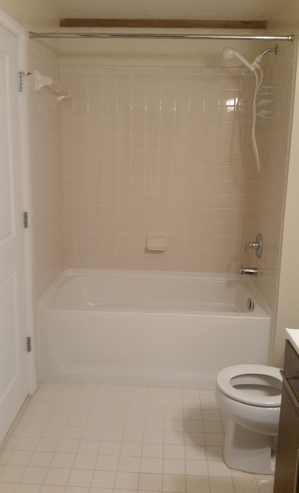
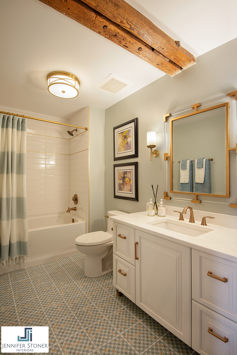
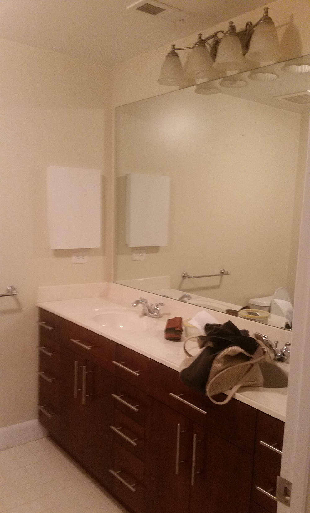
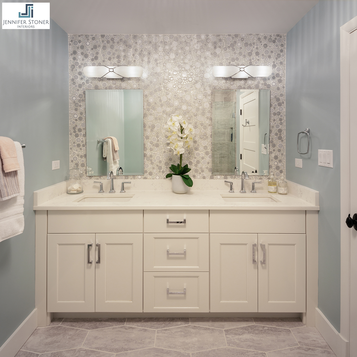
We also gave the two bathrooms in this condo quite an update! They had inexpensive dark stained cabinets, rather boring tile and fixtures and bad lighting. We created fresh, bright bathrooms with better function and certainly more style!
Master Bathroom Tile Detail
We had a lot of fun working on this project because our client trusted us and let us run with some of our crazy ideas and fun color selections. And as always, a good design is all in the details!
Thanks to everyone who supported us as with their votes!
All After photography credited to John Magor Photography. All Before photography credited to Jennifer’s crappy i-phone.
JSI Faves: Before and After Westham Renovation Part 3
Explore more of the interior transformations in part 3 of our series featuring the whole house renovation of a home in Richmond's Westham neighborhood. We share the dramatic changes to the entry, the dining room and the living room, along with some images of the wonderful work of our landscape designer.
I hope you've had a chance to enjoy Parts 1 and 2 of this series where we shared some of the background of this whole house renovation project and some of the dramatic before and after photos of the front elevation of the house and the kitchen. The kitchen transformation was incredible! Today, I'm sharing some of the additional interior spaces and closing with some images of the wonderful work of our landscape designer.
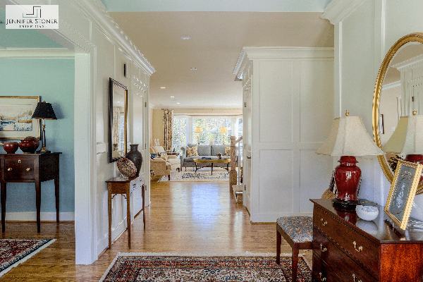
The original foyer was a small unassuming entry with the formal dining room off to the side. We raised the ceiling to create a vaulted area with a loft overlook from the newly added living space on the second floor. We added a classic white wainscoting treatment to the walls for added drama and opened up the views to the back of the house. Figuring out the spacing of that wainscoting was a math challenge. We included a hidden paneled section in the hallway for luggage storage.
The original dining room was adorned with a vintage chinoiserie wallpaper. I've been trying to research the pattern to discern it's age. It's reminiscent of the early de Gournay papers, but the condition of the paper led me to believe that it was older, since de Gournay was started in the late 1980s.
Unfortunately, the wallpaper was not in great shape and also not in keeping with my clients' taste. So, we removed the paper in favor of a nice coat of fresh paint. We also removed an adjoining powder room and added a lovely butler's pantry which is evident through the widened case opening at the back of the room.
The soaring ceilings of new homes were not common in ranch style homes of the fifties, so the entire first floor has 8'3" high ceilings. My clients had enjoyed nice coffered 10' ceilings in their previous home and were hoping to achieve the same look in this house, but the lower ceilings presented a challenge. Instead, we opted to create a more unique geometric design on the ceiling with a shallow 1" deep trim detail.
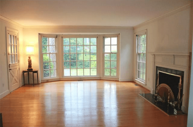
The original living room was a nice open entertaining space with terrific potential. We removed that Dutch door at the back of the room and re-purposed it for our side-door entrance. We replaced all of the hardwood flooring throughout the house when we discovered how much water damage there was from the drenched foundation.
We restored the original fireplace and created new custom cabinetry to display my clients large sculpture collection.
Having traveled to every continent over the years, my clients have collected some wonderful treasures along the way. They've also enjoyed collecting artwork from local artists during their travels and that artwork fits beautifully on the walls of their new home.
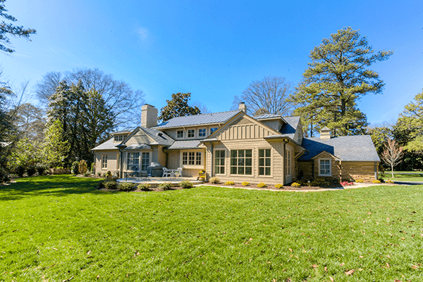
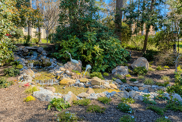
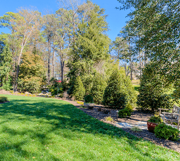
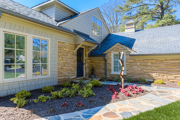
One of the early decisions in this renovation process was that the windows all needed to be replaced. The new windows all have less dividers allowing a more open view to their surrounding property which is wonderful. Another valuable member of our Conception to Completion team was landscape designer, Peggy Ford of Glorious Gardens. When my clients purchased this home, it was overgrown with trees and shrubbery that had been sorely neglected for years. Peggy created beautiful paths, small garden corners and a beautiful pond with a trailing fountain. It's absolutely perfect and will only improve with a little love and age.
I truly enjoyed working on this project because of the combined talents of everyone on our team and because I couldn't ask for better clients. It's very gratifying to breath life back into this neglected home and see it come to life with the energy and happiness of its new family.
JSI Faves: Before and After Westham Renovation Part 2
Part 2 of our Westham Renovation Blog series features the dramatic transformation of the most important room in the house ... the kitchen! Check out how we captured more space and brought the kitchen out of the "golden" era of the 50s.
In this second installment of our blog series featuring our renovation of our client's home in Richmond's Westham neighborhood, we're focusing on the most important room of the house ... the kitchen! We knew when we walked in and saw the original kitchen, we were going to have to test the limits of our clients' imaginations. The original cabinetry with the lemon colored formica countertops and matching walls was quite a throw back to an era gone by.
Original Kitchen
The room was not that small, but the actual work triangle, where most of the culinary magic happens, was quite cramped. There was also a lot of dead space in the middle of the room, yet no place for a breakfast table or casual dining.
Don't you love those yellow countertops?
We knew we would need to capture more space from the back of the house to make this kitchen function better for our clients. Luckily, the kitchen was settled back into an alcove on the back of the house which gave us some room to grow.
Original back of the house showing the kitchen window and door
The door to the left of the kitchen in the photo above was a great old Dutch door that led into the living space. We removed that door and relocated it to the side entry.
Original Dutch door restored and relocated to the client's side door
We removed the door to the patio from the kitchen and relocated that to the newly renovated sunroom off the side. We were then able to capture some of that courtyard space and push the kitchen back. We specified a large 8' wide window over the sink which floods the room with lovely natural light. By moving that wall out we were able to square up the room a little more and include a nice large kitchen island with seating.
The After!
Our clients' previous home had cherry cabinets, so they wanted to lighten things up this time. But, they have a house full of treasured furniture pieces with some very traditional darker finishes. A bright white kitchen, as is all the rage these days, would have looked too cold and out of place in their home. Instead, we opted for a soft linen white cabinet from Brookhaven mixed with a walnut stained island.
A dramatic contrast to the original kitchen!
We found a good light and neutral granite for the countertops and mixed it with honed travertine subway tiles on the backsplash. My clients now have ample cabinetry storage and lots of counterspace to make nice big family meals. A big thank you goes to Matt Gunn of Classic Kitchens of Virginia who collaborated in our kitchen design. He was a terrific partner in this team effort!
Tomorrow, we'll take a peak at some of the other interior transformations in this home. Stay tuned...


